The January challenge was centered around the Pantone top-ten list of colors of the year, which features "Greenery" as the star. These colors are described as "a mixture of vitality, relaxation, and the great outdoors."

In case you're interested, here's another look at that collection of colors (this time without the beads):

So! The idea was to use those colors as a springboard for jewelry designs. The beads shown in the picture were the selections made by Molly Schaller to go along with the colors. However, when I visited my local Michaels, many of those official selections were out of stock.
I was not deterred, however! After all, I had Christmas gift cards to use. So, from that palette, here are the beads that I picked out:


After quite a bit of debate, I decided to split those beads up into three distinct sub-palettes--two of which have the signature "Greenery" shade. (What was the third palette? Well, you just have to keep reading to find out!)
(And now it's time for a quick side note: of course, re-reading the official guidelines for this challenge, I see now that we were supposed to use a subset of 4 or 6 colors. Oops! Ah well, at least one of my sub-palettes fits that category... That's what I get for not double-checking the introduction post before I started creating!)
So! Now that I'm sure you're thoroughly curious, here are the three color collections I came up with--and what I made to match them!
Palette #1

I love these two shades of green together... they remind me of the many hues of trees, whether they're in shadow (kale) or in sunlight (greenery).
I also thought that the rectangle spear-beads that I purchased did a good job capturing both of those colors... So, those are what I used to make this first set:


I paired them with silver-tone metal and hand-cut peridot saucers. The necklace is actually fairly long... I'm debating making a shorter, matching one to be used for layering with it.

That's not all I made for this sub-palette. I had more of the rectangles left, so I made another pair of earrings:

These use the faceted light green glass beads instead of the peridot, resulting in a bit of a brighter look. I even tried my hand at some messy wire-wrapping (which is surprisingly difficult for me to do, just because I like making things tidy!).


Palette #2

For this second palette, I decided to mix some of the more summery shades with the deep richness of the lapis blue. The resulting set is quite lovely:
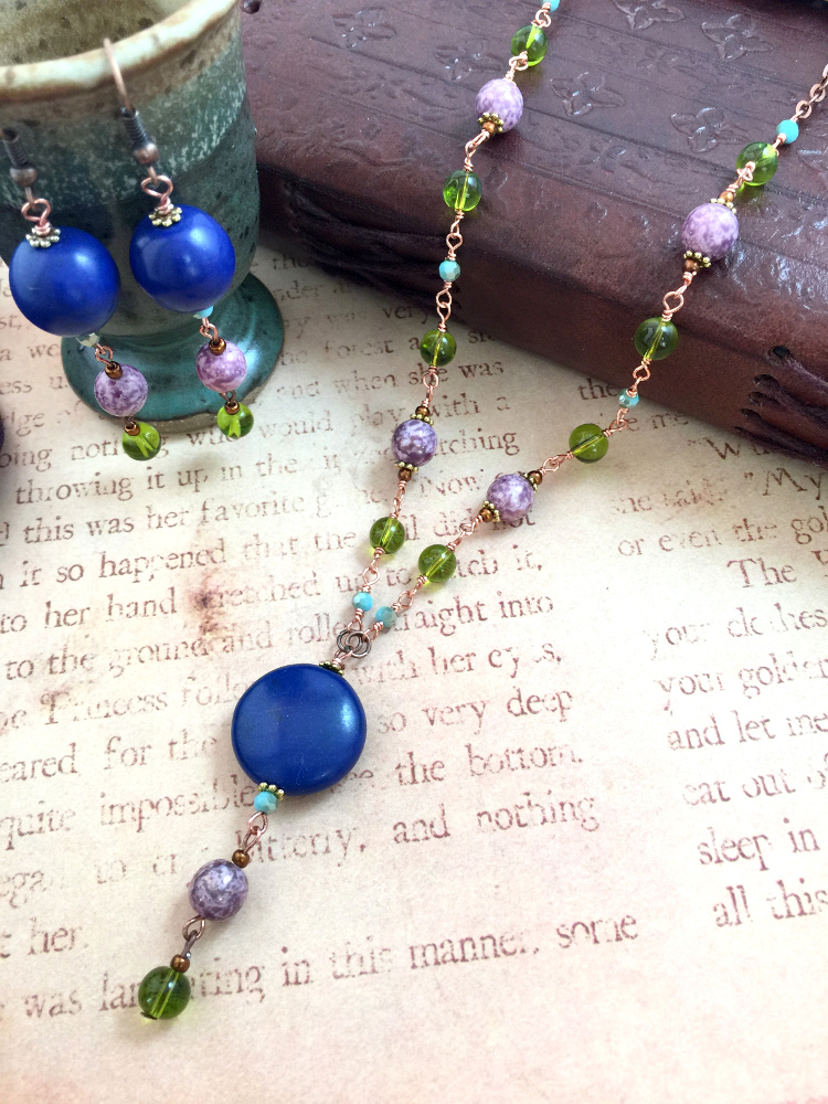
Confession time: this was actually a last minute edition... I made this set this morning! I found the lapis blue beads while sorting through a mix I also picked up from Michaels (essentially a dark blue version of this one), and it inspired me to put this together.
This set is made with varying shades of copper and gold, and makes me think of flowers on a beach, next to sparkling blue waters.


Palette #3

This last palette is actually the one that really stood out to me while I was shopping for beads--and the one that I couldn't wait to start creating. Granted, there is no Greenery in sight... but I think the necklace set I made is still gorgeous:


It's a tassel necklace!
...This time, featuring a pendant and tassel by Sedona. The Czech beads--both the blue and the dark gold--matched it so perfectly that I just had to put them together. And I love the result so much, I'm going to inundate you with many pictures! :)


So, there you go! That's what I made for this month's Pretty Palettes challenge!
Thanks to Molly Schaller and Halcraft for putting together such a fun challenge! And thank you so much for stopping by to see what I made! Of course, feel free to check out the official Halcraft blog to see what everyone else ended up creating.
Have a wonderful Wednesday, everyone!
Oh, my goodness! These pieces are beautiful, Ana! I'm trying to pick a favorite, but I don't think I can pick just one piece. I especially love how you picked out a few of the colors from the palette to make "mini-palettes", sort of swatches. The light turquoise blue (Island Paradise) and hazelnut are amazing together. Your up close photo of your wrapped links flowing back and forth is gorgeous. Thank you so much for playing along!
ReplyDeleteHave a wonderful day & keep on beading!
Molly
Truly lovely designs. I like the mini-palettes that you chose to work with. I especially love those green beads. I used them in a piece that will be in an upcoming magazine. They are one of those beads that everytime I see them I buy them up, no matter the cost! Enjoy the day. Erin
ReplyDelete